Designing Decentralized Storage
Without Better UX, Decentralization Remains an Underutilized Alternative
Context
Today I want to talk about design and how it can help us find our way through complex protocols. In an ideal world, things just work. Disciplines are perfectly siloed and problems are easy to solve. You don't need all the context on how things around you work. They just... work.
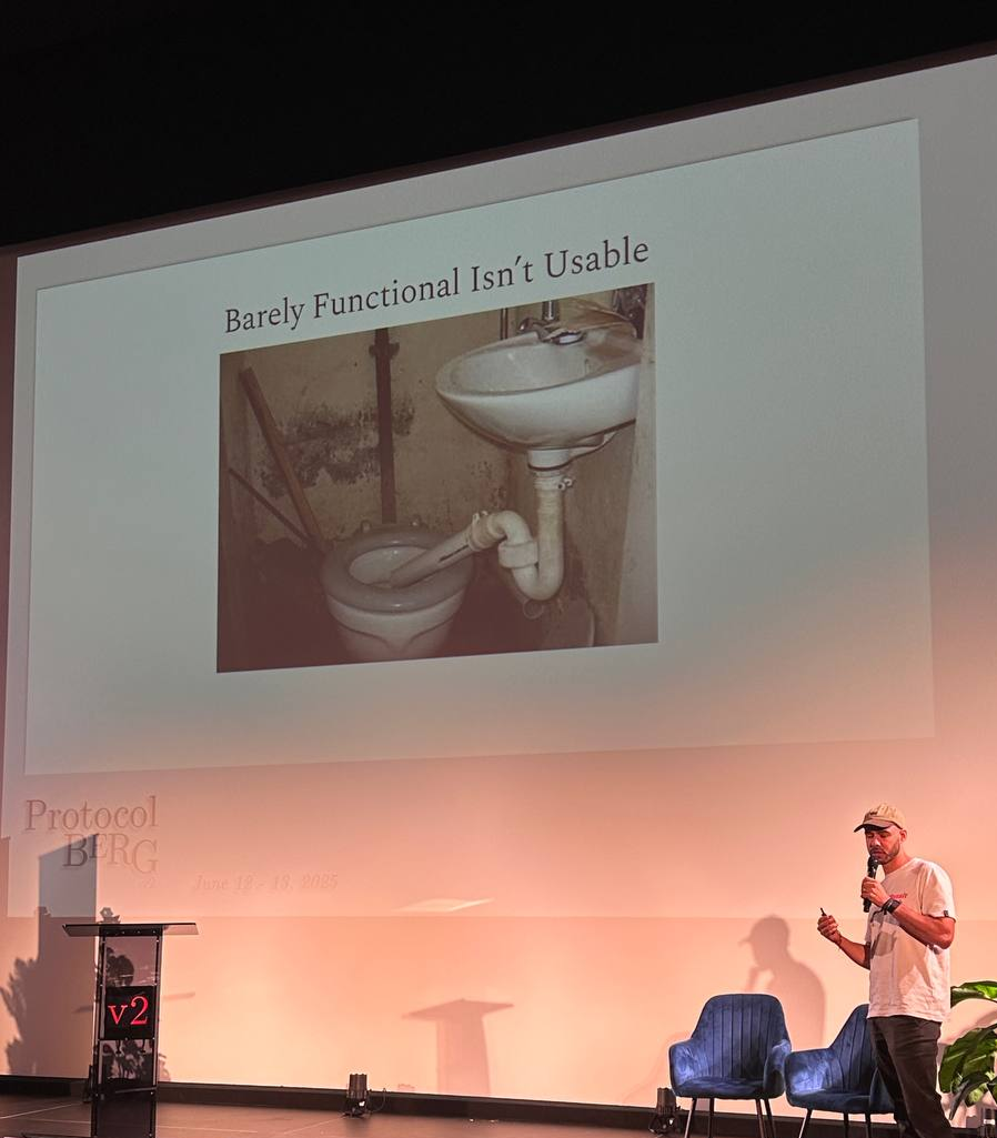
Take your toilet, for example. You don't exactly know where the pipes go in your house. Water comes out of the tap and, in the event of an emergency, you just call a guy. Decentralized storage feels a bit like plumbing. Except not only do you not know where the pipes go, but you'll need to break layers of concrete and soil before even getting answers—and in the end, you don't know who to call to get it sorted.
Presenting at Protocol Berg
I mean, you can poop and wash your hands. Sort of. It's functional, but you probably won't return for a second time. We want to create products that solve user needs while adhering to the principles of decentralization that we believe in. But in a world where user attention is the greatest commodity, we can't afford to release products that look like that.
The Two Layers of Design
How can we live up to the ethical imperative of decentralization—giving users censorship-resistance, permanence, ownership, and privacy on their data—while also mitigating technology's known shortcomings, like performance, and providing great UX?

- Developer UX: the underground system—the pipes
- User UX: the visible experience—the sink and toilet
If the pipes are confusing, brittle, or unreliable, the user experience suffers no matter how polished the surface is. Design can help us find our way through this.
Improving Developer UX: The Web2 Playbook
It's no mystery why devs turn to centralized alternatives when it comes to storage. Improving Dev UX is crucial for making decentralized storage the default. For protocols and infrastructure players, the question is: How can we hide protocol complexity while preserving benefits?
With simple patterns, there can be a big gain in how we onboard devs.
1. Frictionless Onboarding
We must onboard users quickly, clearly guiding them to early wins without requiring them to read dozens of docs, watch tutorials, ask on Discord, or thoroughly understand protocol-level tech to host a file. Minimize setup. Delay decisions. Let devs feel value before asking for tokens.
Example: Cloudflare
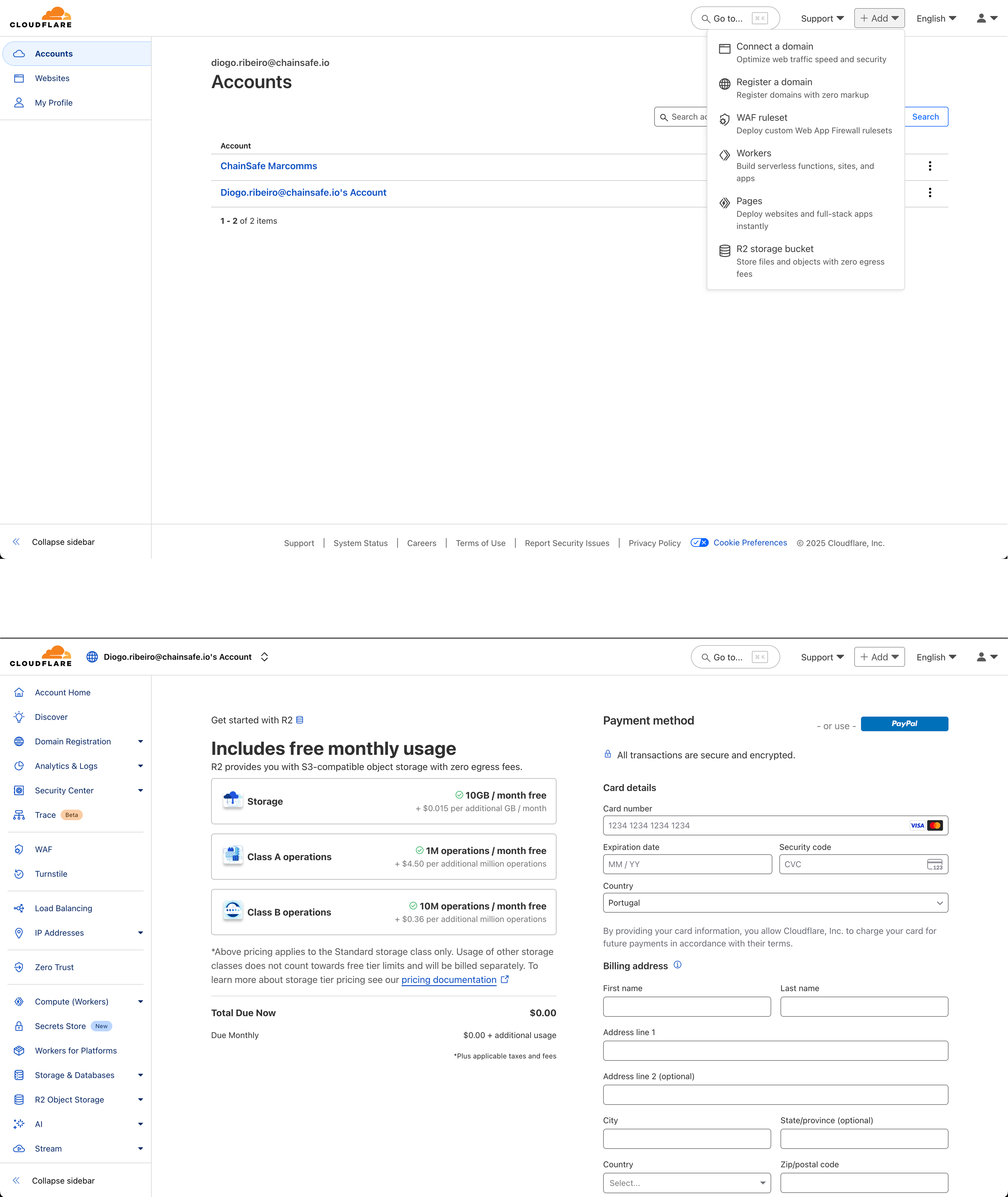
Cloudflare's UI clearly communicates:
- What's free
- What costs money
- What the user should expect next
Players in the industry applying similar patterns and success: web3.storage & skiracha, but often failing to add visibility to the advantages for the end user.
2. Make Incentives Intuitive and Fair
Incentives ≠ tokenomics. Pricing transparency and tooling are part of the incentive.
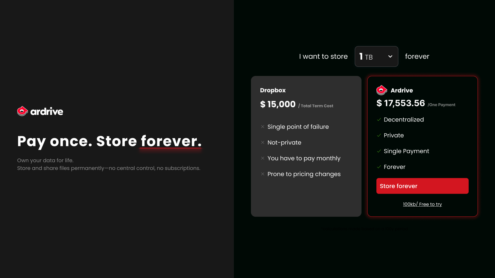
Example: Dropbox vs ArDrive & Arweave
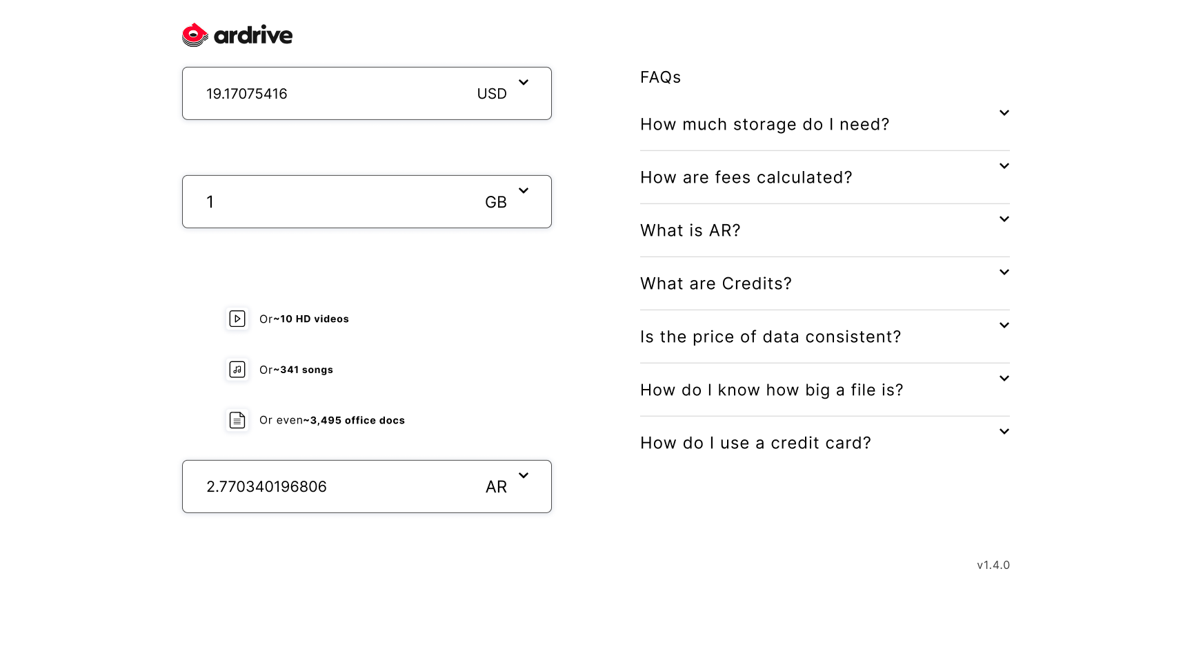
ArDrive's pricing page
Prefer common UX patterns to complex calculators, but do offer calculators as an expanded benefit. Avoid/abstract wallet/token verbiage that may make it difficult to compare to traditional options (e.g., how do I know ArDrive compares with Dropbox?). The current pricing page is not surfacing enough context on features like permanence. Because there's no context on the pricing model (you pay once and store it forever) it's hard to compare it directly with other centralized alternatives, making it necessary to create a similar mental model (here I assumed a 100y timeline to be able to compare both services).
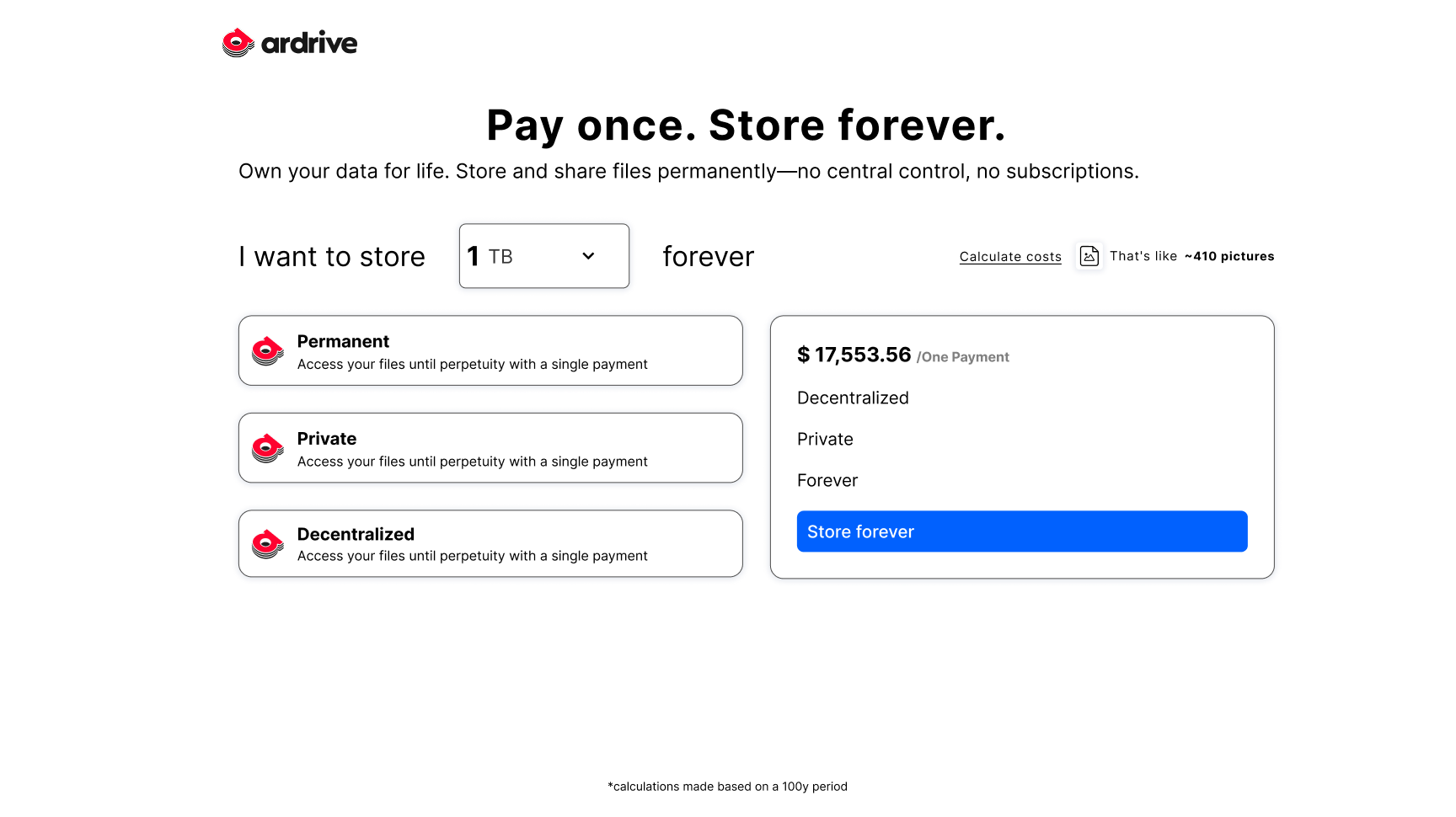
Two ideas for Redesigning ArDrive's pricing UX to match user expectations and build trust
3. Design for Belief
Provide visibility to decentralized storage's strong arguments (e.g., permanence, redundancy, censorship resistance):
- Surface protocol implications—e.g., Arweave: "$3.8/month for 1 GB permanent storage over 1 year vs $1.15 on S3 Standard."
- Auto-flag files near expiration → trigger top-up
- Surface who's storing your data → reward visibility (e.g., UI says "Stored by node XYZ")
Better Dev UX = Better End User UX
If devs struggle to work with a protocol, they either give up—or ship brittle interfaces. Improving Dev UX is the only way to consistently improve end-user experience.
Improving User UX: Adapting to Infra Constraints
Improving Dev UX is most of the time outside of our direct control. While we can advocate, suggest, request changes and contribute to open source projects at the end of the day, we often have to work with what we've been given. So, without waiting for protocol-level changes, how do we improve what our users see when the infrastructure often constrains what we can offer?
Can Devs Do Something?
Yes. Adopting a set of UX primitives can help mitigate current constraints and match user expectations around four key pillars:
- Access (Can I see my stuff?)
- Speed (Is it fast?)
- Security (Is it safe?)
- Trust (Will it still be there?)
Speed: Design for Perceived Performance
Design for perceived performance, even if protocol reality lags. One of the most common shortcomings of current UIs built on decentralized infrastructure is performance. By using progressive rendering patterns and UX, we can address this.
- Optimistic UI — Assume success, then show updates, avoid excess spinners, prefer on-brand UIs.
- Async/Non-locking UI states
- Hybrid storage design (e.g., Centralized DB + API + Arweave fallback)
Access: Make Storage Visible
UI: Error messaging & retry UI, gateway fallback logic, status indicators, CID health visualization.
Security: Design for Perceived Safety
Design for perceived safety, informing users on how their data is protected.
- Show encryption + storage region
- Contextual cues - Human-readable tooltips (e.g., "This is stored on Filecoin in 3 regions")
- Term/permanence info (e.g., "This deal lasts 6 months")
Trust: Build Trust Through Transparency
Promote user control and proof of infrastructure, benefiting user trust.
- File health dashboards: Is it pinned? By whom? How many nodes?
- "Decentralization meter" — e.g., file has 5 active copies, 3 geographies
Conclusion
Improving the dev UX will make decentralized storage the default building block of the internet of the future. Focusing on the user will create decentralized experiences where the infrastructure is transparent.
If we hide protocol complexity while preserving the benefits of decentralization, we don't just onboard the next billion users—we make decentralization invisible, usable, and inevitable.
By improving developer onboarding and adapting to infrastructure constraints through design principles like visibility, control, and the F.O.N.D. framework—Fast, Observable, No-surprises, Durable—we create interfaces that feel familiar, work seamlessly, and uphold the values that matter most.
Let's build an internet people don't have to understand—just one they can trust.